
History of Typography 2007 Calendar
History of Typography Is Celebrated in Pentagram-Designed 2007 Classic Calendar
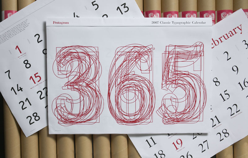
An extraordinary history of typeface development, reflecting prevailing limitations or technological advances, lies behind apparently ordinary letters or numbers found on familiar objects. Very few of us are aware of the rich cultural history behind what we read. The 2007 Pentagram Classic Typographic Calendar, designed by Kit Hinrichs, partner of the legendary international multi-disciplinary design consultancy Pentagram, captures the essence of typeface development.
Each calendar month is distinguished by a unique typeface selected by Hinrichs, which is accompanied by a short synopsis of its genesis. His selections include popular and obscure typefaces, whose origins span contemporary (created digitally) to 15th century roots (created using hand-drawn characters) by some of the industry’s acclaimed typographers, as well as those lesser-known. All characters and digits appearing in the calendar have been redrawn digitally.
For instance, “Whitney” (July), designed by Tobias Frere-Jones for the Whitney Museum in New York, was created for the institution in a multitude of applications. The result is a typeface, which successfully tackles the often-conflicting demands across multiple forms of media, from catalogs, directory listings to signage.
“Requiem” (April), designed by Jonathan Hoefler, was eventually developed for Travel and Leisure magazine. Its origins are based on inscriptional capitals appearing in Ludovico Vicentinodegli Arrighi’s 1523 writing manual, “Il Modo de Temperare le Penne.” He added ornaments, italic ligatures and other elements.
“Janson” (February), designed by Nicholas Kis (1650 to 1702) was the forerunner to many 20th century fonts. This classic typeface was named after the Dutch letter founder Anton Janson. Kis’s career as a type designer began when he was a theology student from Transylvania. He was sent to Holland to supervise the printing of a bible. He became fascinated with type design and continued his life as a type designer.
“I wanted to bring a new awareness of typographic design through this calendar,” says Kit Hinrichs. “Typefaces are pervasive in our daily lives in everything we read and see around us and yet most people are oblivious of them or the circumstances in which they were created. We can gain a new perspective on our world by studying the origin of typefaces. I hope the calendar will encourage a new sensitivity to the importance of typeface usage.”
Past calendar months have a new lease of life as gift-wrapping paper. By selecting the appropriate month, circling the day with a marker pen and writing a personal greeting, each calendar month is transformed into a unique gift-wrap, offering a creative way of conveying your message and saving a few trees along the way. The calendar ultimately provides up to 12 different types of wrapping paper.
This collectible calendar is designed in both wall and desk formats and includes U.S. and U.K. national and public holidays. The design challenge was to create a classic, clear and simple calendar, for home and office use. The calendar is designed in two sizes; a super size 33-by-22 inch version, which is packaged in a tube and suitable for wall hanging and a smaller 18-by-12 inch version for wall and desk-use, which is packaged in shrink wrap.
The graphic look, application and typographically sensitive style of Pentagram’s calendar echoes the firm’s core design values: simple, clean and timeless design and a rigorous, strategic, ideas-based approach to the design process, always celebrating the craft of the individual designer.
Labels: 2007, calendar, characters, date, designer, font, graphic design, history, kit hinrichs, letters, month, pentagram, typography
posted by Matthew Shadbolt at
8:49 PM
![]()
![]()


0 Comments:
Post a Comment
Subscribe to Post Comments [Atom]
<< Home