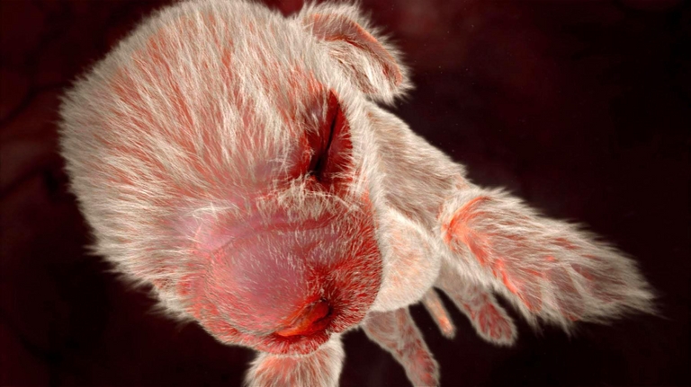
Always Inspiring: Matthew Barney's Drawing Restraint 9
posted by Matthew Shadbolt at
6:07 AM
0 Comments
![]()
![]()

posted by Matthew Shadbolt at
6:07 AM
0 Comments
![]()
![]()

Labels: graphic design, london, oskar karlin, poster, redesign, stockholm, subway, time travel
posted by Matthew Shadbolt at
6:08 AM
0 Comments
![]()
![]()
Labels: comedy, cosmo kramer, elaine benes, george costanza, jerry seinfeld, nbc, newman, seinfeld, sitcom, superman, television show
posted by Matthew Shadbolt at
9:14 AM
0 Comments
![]()
![]()
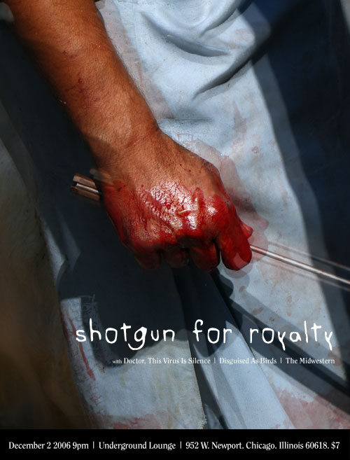
Labels: band photography, chicago, indie music, live show, myspace posters, poster, print, shotgun for royalty
posted by Matthew Shadbolt at
9:46 AM
0 Comments
![]()
![]()

Labels: channels, controller, game design, gamers, gaming, interactive, japan, mario, mii, nintendo, television, video games, wii
posted by Matthew Shadbolt at
7:14 PM
0 Comments
![]()
![]()

Labels: band photography, indie music, live music, mary kamphausen, photoblog, photography, tiger fly
posted by Matthew Shadbolt at
1:33 PM
0 Comments
![]()
![]()

Labels: charts, countdown, flash, graphic design, rockstar, typography, web design
posted by Matthew Shadbolt at
6:11 AM
0 Comments
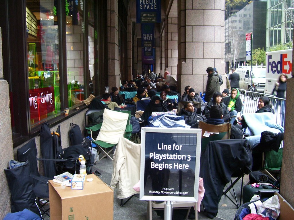
![]()
![]()

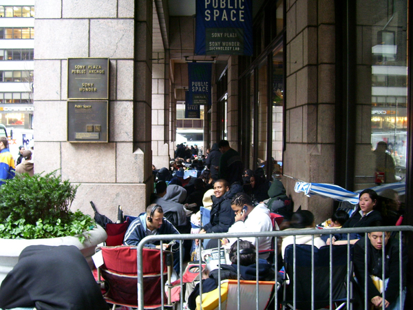
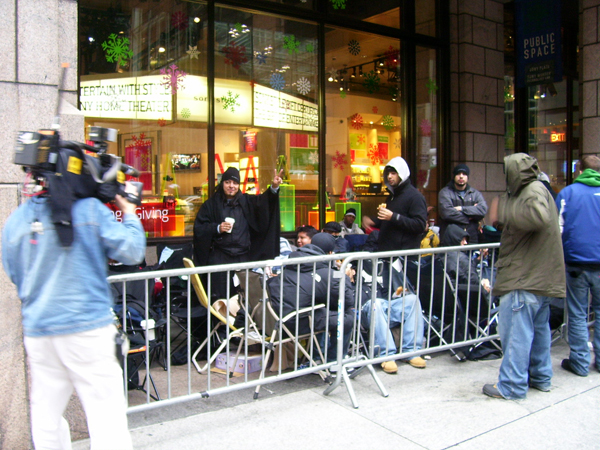

Labels: camping, console camp, gamers, madison avenue, playstation 3, playstation launch, sony building, video games, waiting
posted by Matthew Shadbolt at
6:21 AM
1 Comments
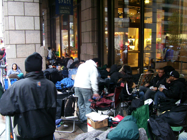
![]()
![]()
Labels: madison avenue, playstation 3, playstation launch, sony, sony building, video games, waiting
posted by Matthew Shadbolt at
6:14 PM
1 Comments
![]()
![]()
Labels: algorithm, children, education, japan, march, pedagogy, pitagora suitchi, pythagoras switch, rube goldberg, television show, thinking, wikipedia
posted by Matthew Shadbolt at
8:06 PM
0 Comments
![]()
![]()
Labels: algorithm, dance, japan, kids, march, pythagoras switch, taiso, television show
posted by Matthew Shadbolt at
8:58 AM
0 Comments
![]()
![]()

Labels: blog, commercials, culture, editing, editors, jake davis, music choice, new york, nike, sneakers, style
posted by Matthew Shadbolt at
10:15 PM
0 Comments
![]()
![]()
Labels: daily bugle, marvel, movie, peter parker, preview, sandman, sequel, special effects, spiderman, trailer, venom
posted by Matthew Shadbolt at
3:15 PM
0 Comments
![]()
![]()
Labels: akamai, designer, download, html, loading, online, seconds, shopping, speed, survey, time travel, user interface, website
posted by Matthew Shadbolt at
9:12 PM
0 Comments
![]()
![]()
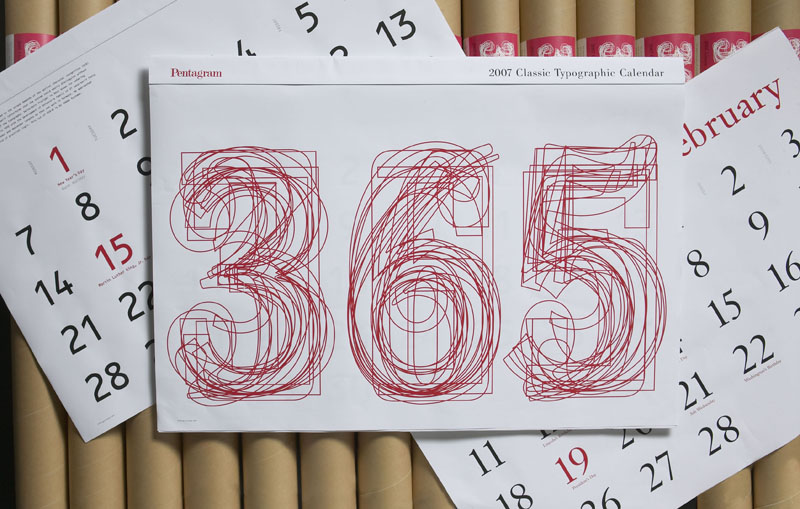
Labels: 2007, calendar, characters, date, designer, font, graphic design, history, kit hinrichs, letters, month, pentagram, typography
posted by Matthew Shadbolt at
8:49 PM
0 Comments
![]()
![]()
Labels: denville, font, halloween, helvetica, logo, morris county, new jersey, sign, station, township, transit, typography
posted by Matthew Shadbolt at
9:19 AM
0 Comments
![]()
![]()
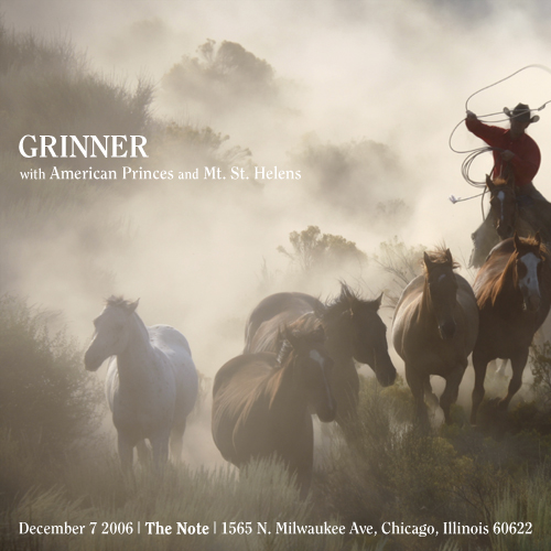
Labels: chicago, graphic design, grinner, indie music, live music, live show, myspace posters, poster, rock
posted by Matthew Shadbolt at
3:21 AM
0 Comments
![]()
![]()
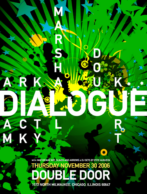
Labels: chicago, dialogue, double door, indie music, myspace posters, poster
posted by Matthew Shadbolt at
7:54 PM
0 Comments
![]()
![]()
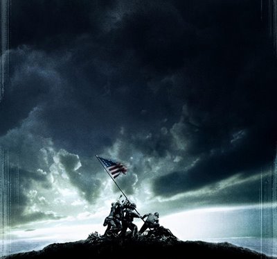
Labels: action, battle, clint eastwood, flags of our fathers, iwo jima, movie, photography, soldiers, victory, war
posted by Matthew Shadbolt at
5:52 AM
0 Comments
![]()
![]()
Labels: mario, nintendo, preview, smash brothers, trailer, video games, wii
posted by Matthew Shadbolt at
8:55 AM
0 Comments
![]()
![]()
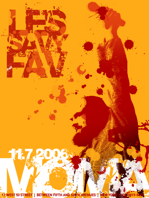
Labels: indie music, les savy fav, live music, mary kamphausen, moma, myspace posters, new york, poster, tiger fly
posted by Matthew Shadbolt at
6:00 PM
0 Comments
![]()
![]()